U.S. Textile and Apparel Industries and Rural America:
Geographic Concentration of U.S. Textile and Apparel Industries
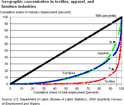
The geographic concentration of textile and apparel employment
in the United States is best demonstrated using Lorenz
curves that plot the cumulative share of national employment
against the ranked cumulative share of industry employment.
Thus, if every county in the United States employed the
same share of its workers in an industry, that industry’s
Lorenz curve would trace out a 45-degree line from the
origin. This would represent equally dispersed employment.
Industry employment is more geographically concentrated
the farther an industry Lorenz curve is from the 45-degree
line.
Lorenz curves for textiles, apparel, and furniture are
provided below. They are three of the five U.S. industries
that display the highest geographical concentration nationwide.
(The other two are transportation equipment and primary
metals.) The degree of geographic concentration of the
textile industry is indeed exceptional. Reading along
the 95th percentile line provides the best indication
of the difference in geographic concentration. The counties
to the right of the 95th percentile represent those most
specialized in an industry that together account for 5
percent of national employment. Their share of industry
employment is the complement of where the Lorenz curve
and the 95th percentile line intersect. For example, the
textiles line intersects the 95th percentile at roughly
20 percent on the y-axis (point A), meaning that the most
specialized counties account for close to 80 percent of
textile employment. In comparison, the most specialized
apparel counties claiming 5 percent of total private employment
account for only 35 percent of industry employment (point
B).

For more information on Lorenz curves, see “The
Gini Coefficient as a Measure of Income Inequality,”
Food
Security Assessment, GFA-9, November 1997, p. 44.
|